So I am wanting to spruce up my photography blog a bit with a new background, but just can't make up my mind. I want something that reflects me and will work with my logo and colors as well. I am still searching, but here are my favs so far...
#1
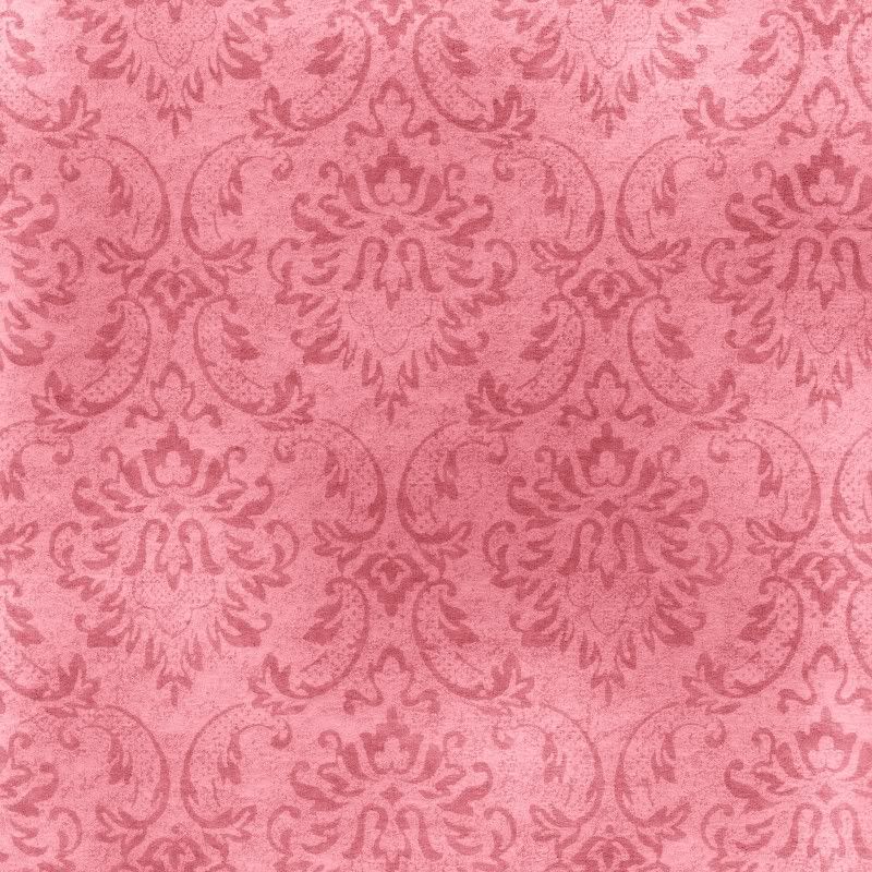
#2
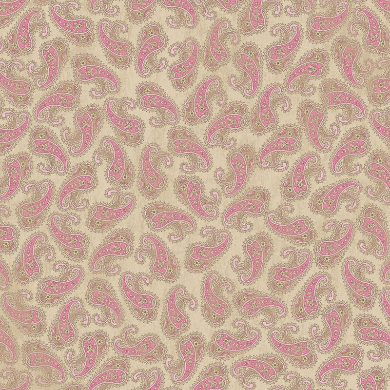
#3
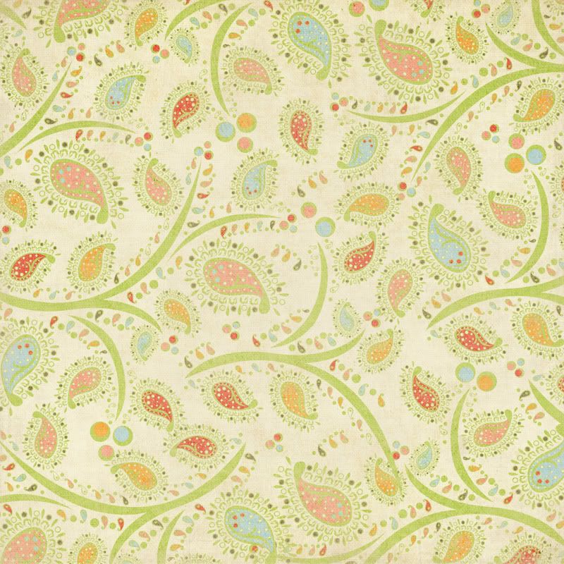
#4

#5

#6
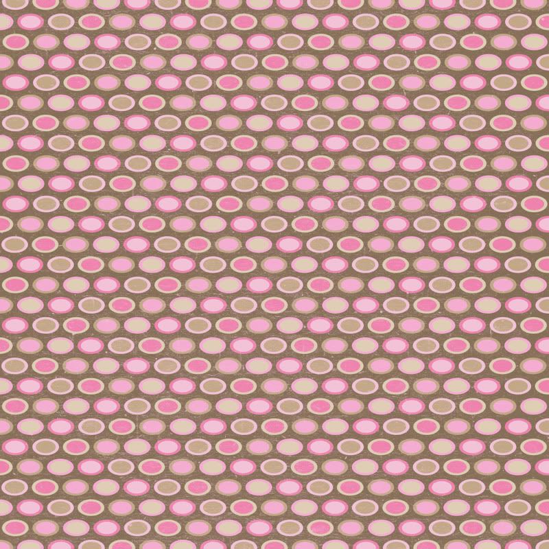
So tell me what you think for now and I'm still gonna keep looking around. I have #4 on there right now,but I just don't know. Tell me what you think!! Thanks guys!!


8 comments:
1, 4 and 5 are my favorite...cute choices...
I like 1 and 6. Those are my favorites.
I really like them all...but I think the first pattern will be less busy...and will not take away from your photos. I think that is an issue. You want your pictures to be what people see first...not the back ground.
1 and 5 are my favorites.
The plain polka-dots is my fave. its not too busy to be distracting...and so YOU!!!
I've got to go with 1 and 2!
I like 1 & 6
I love number 1 :)
Post a Comment